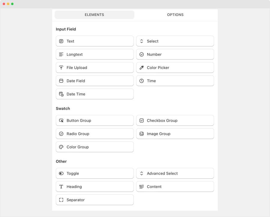
Tiger Product Options offer 19 types of options to enhance your customers’ choices on the product page. These include:

Input fields
- Text: Provides an input field for customers to modify text, suitable for one-line entries.
- Select: add select box that support single or multiple selection
- Long text: text area field (multiple lines) to modify text, suitable for one-line entries.
- File upload: Enables customers to upload photos
- Color picker: add color picker field
- Date field
- Time
- Date time
Swatch:
- Button group: Shows option values as buttons, allowing customers to select only one option at a time.
- Checkbox group: Provides square boxes for customers to select one or more options.
- Radio group: Presents small circles for customers to select one option at a time.
- Image group: Displays a selection of images for customers to choose from.
- Color group: Offers a variety of colors for customers to select.
Other:
- Toggle: Presents a toggle switch for customers to enable or disable an option.
- Advanced select
- Heading
- Content
- Separator
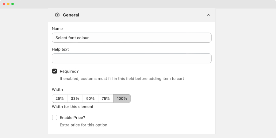
After choosing an option type, you’ll see all general settings for this option.
Note: These settings will be a little different between each option type
General settings
- Title: This will show on your product page above the values of your option.
- Required?: Enable this option if you want the field to be required
- Width: set the width of the field
- Enable Price? If yes, you can set add-on price for the options of the field

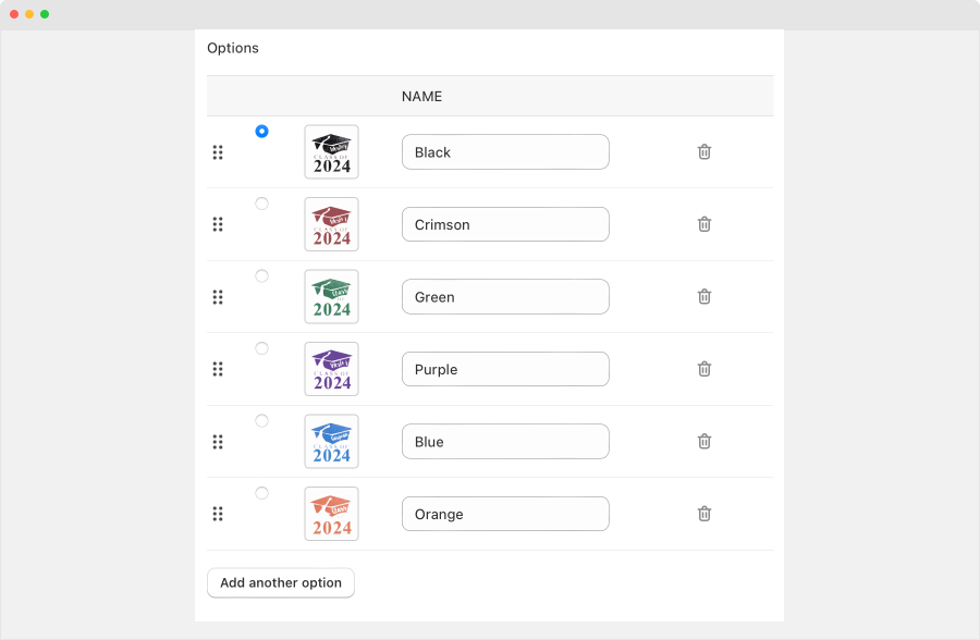
Options
- Click on Add another option to create new option
- Add option name, image and set which option is the default

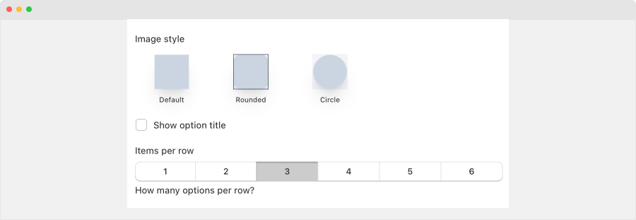
Other settings:
- Image style
- Show the option title or not
- Set number of options to be shown in one row
- Conditional settings: Add rules to show this option based on previous selections
